Lab · Hands-on Exercise
Telco Customer Churn Analytics
A hands-on training dataset for building Power BI dashboards — explore customer demographics, subscribed services, contracts, and billing to model, calculate DAX metrics, and visualize customer churn risks.
You are employed as a Data Analyst with a Telecommunications Provider. You have detailed customer behavior records covering 7,043 subscribers across demographics, subscribed services, contract terms, and monthly billing. Your objective is to build an interactive dashboard in Power BI Desktop to calculate Churn Rate & Lost Revenue, pinpoint high-risk contract types, and evaluate service friction points.
Dataset Overview & Column Definitions
The dataset contains 7,043 unique subscriber records structured across three interconnected operational domains: Demographics, Subscribed Services, and Contract & Billing.
| Column Name | Explanation & Values | Category |
|---|---|---|
| customerID | Unique identifier assigned to each subscriber. | Demographics |
| gender | Customer gender (Male / Female). | Demographics |
| SeniorCitizen | Indicates if customer is a senior citizen (1 = Yes, 0 = No). | Demographics |
| Partner | Indicates if the customer has a partner or spouse (Yes / No). | Demographics |
| Dependents | Indicates if customer lives with dependents (Yes / No). | Demographics |
| tenure | Total number of months subscribed with the company. | Lifecycle / Billing |
| PhoneService | Indicates if subscribed to home phone service (Yes / No). | Services |
| MultipleLines | Multiple telephone lines (Yes / No / No phone service). | Services |
| InternetService | Internet connection provider (DSL, Fiber optic, No). | Services |
| OnlineSecurity | Online security add-on package (Yes / No / No internet). | Services |
| OnlineBackup | Online cloud backup add-on (Yes / No / No internet). | Services |
| DeviceProtection | Device insurance coverage (Yes / No / No internet). | Services |
| TechSupport | Technical support add-on service (Yes / No / No internet). | Services |
| StreamingTV | IPTV streaming subscription (Yes / No / No internet). | Services |
| StreamingMovies | Movie streaming subscription (Yes / No / No internet). | Services |
| Contract | Contract terms (Month-to-month, One year, Two year). | Contract & Billing |
| PaperlessBilling | Customer opted for digital invoicing (Yes / No). | Contract & Billing |
| PaymentMethod | Payment mode (Electronic check, Mailed check, Bank transfer, Credit card). | Contract & Billing |
| MonthlyCharges | The amount billed to the customer on a monthly basis. | Contract & Billing |
| TotalCharges | Total cumulative expenditure over the customer tenure. | Contract & Billing |
| Churn TARGET | Primary outcome: whether customer left (Yes / No). | Outcome Target |
Setup — Load the Data
Connect Power BI Desktop to the CSV data file before building DAX measures and visuals.
In Power BI Desktop, select Home → Get Data → Text/CSV. Navigate to
datafiles/Customer-Churn.csv and click Open.
In the preview window, confirm that column headers are loaded properly and click Load (or Transform Data to inspect field data types). Rename the table to
churn for clean DAX referencing.
1
Task #1: Churn & Revenue KPI Cards
Calculate headline metrics: Total Customers, Churned Customers, Churn %, and Lost Monthly Revenue
Create DAX Measure [churnyes]: Write an explicit measure to count the total number of churned subscribers (where
Churn = "Yes"):
churnyes = CALCULATE(COUNT(churn[Churn]), churn[Churn] = "Yes")
Create DAX Measure [lostrevenue]: Calculate the total lost monthly recurring revenue from churned customers:
lostrevenue = CALCULATE(SUM(churn[MonthlyCharges]), churn[Churn] = "Yes")
Create DAX Measure [churn percentage]: Divide churned customers by total subscribers to get the overall churn rate:
churn percentage = DIVIDE(churn[churnyes], COUNT(churn[Churn]), 0)
Build Card Visuals / KPI Cards: Place 4 Card visuals at the top of the canvas displaying Total Customers (7,043), Churn (1,869), % Churn (26.54%), and Lost Revenue (139.13K).
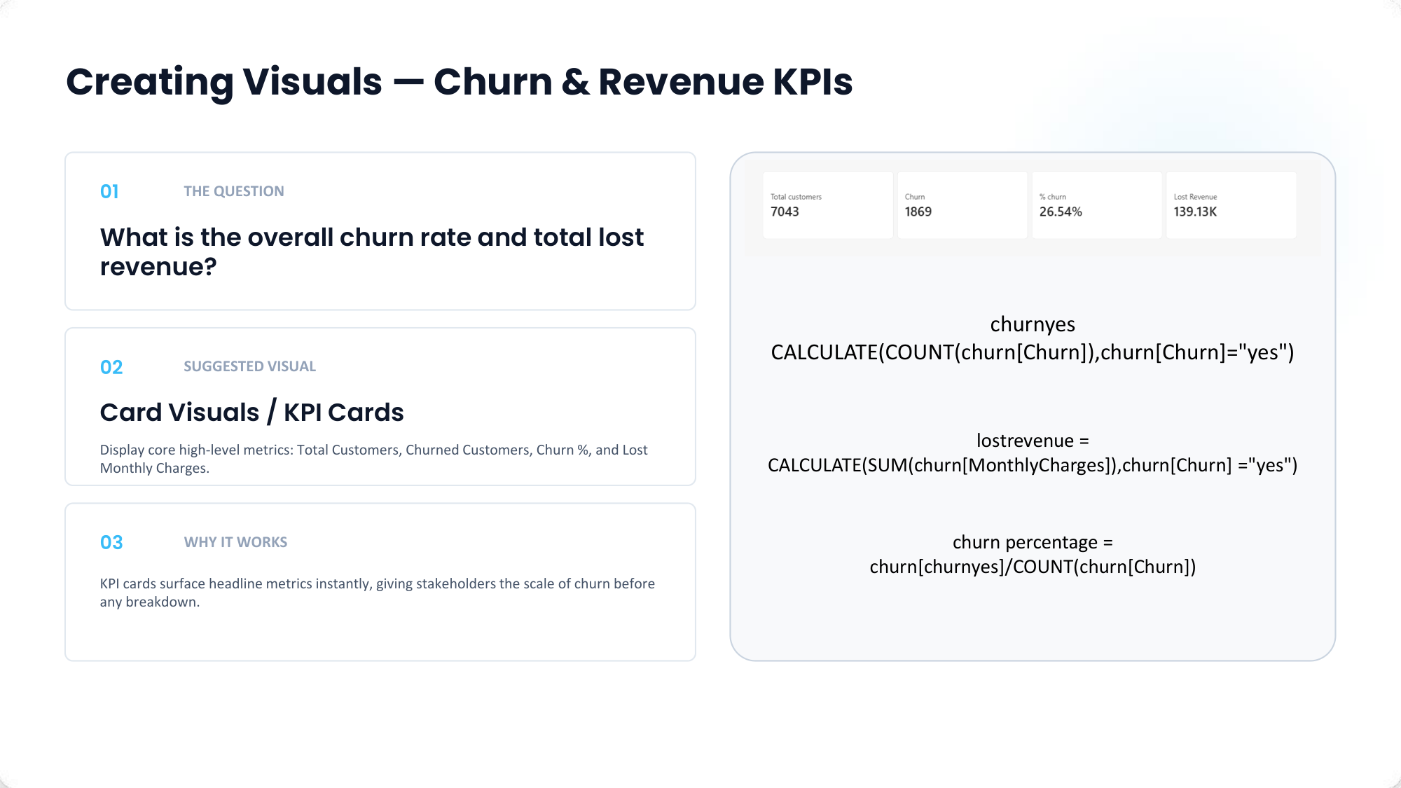
KPI Cards: Top banner showing Total Customers, Churned Customers, Churn %, and Lost Monthly Revenue.
2
Task #2: Churn by Contract Type
Expose how contract commitment terms (Month-to-month vs 1-Year vs 2-Year) drive attrition
Add Stacked Bar / Clustered Bar Visual: Select 100% Stacked Bar Chart or Clustered Bar Chart from the Visualizations pane.
Configure field mapping: Place
Contract on the Y-axis, customerID (Count) on the X-axis, and Churn on the Legend.
Analytical Insight: Comparing contract shares side by side demonstrates that Month-to-month contracts account for the overwhelming majority of lost subscribers compared to long-term 1-year and 2-year plans.
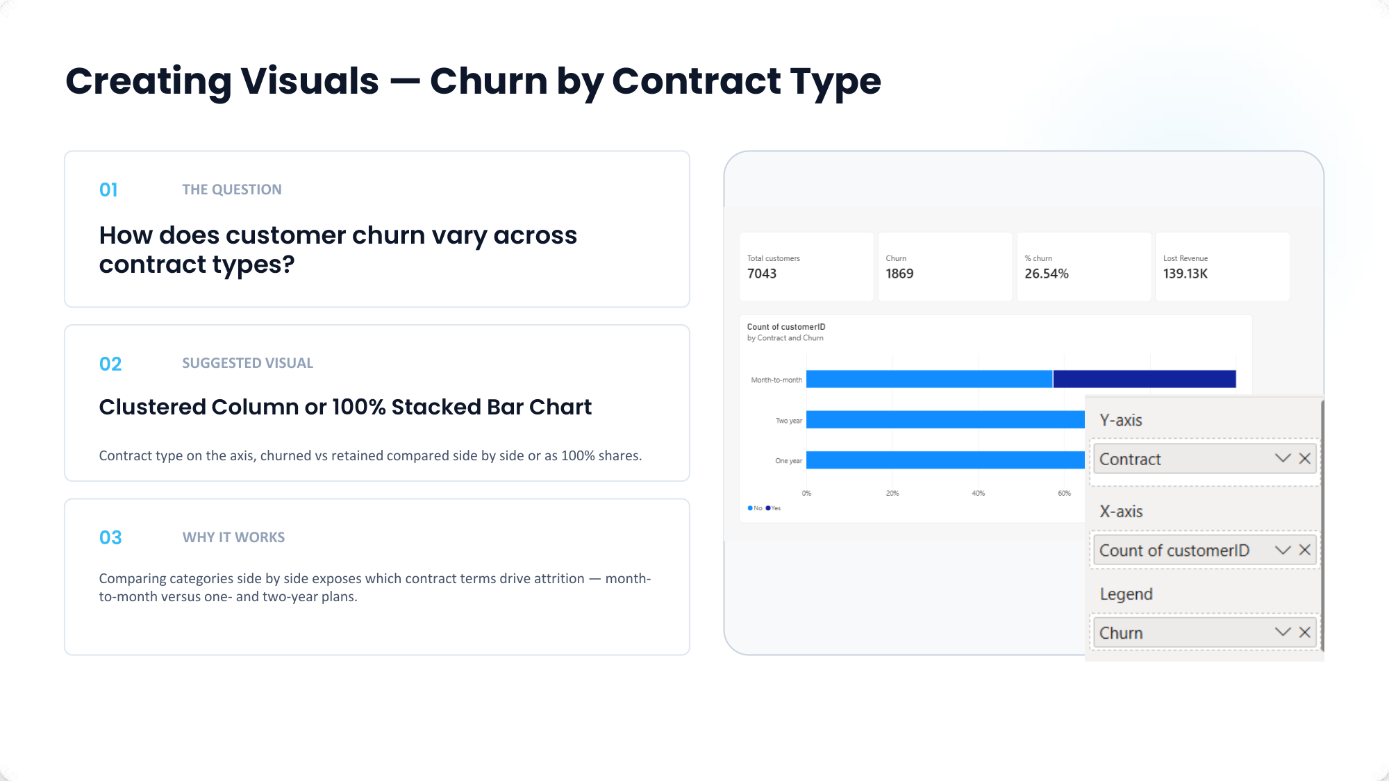
100% Stacked Bar Chart: Comparing churned vs retained customer proportions by Contract type.
3
Task #3: Churn by Internet Service
Analyze which technology provider type (DSL, Fiber Optic, No Internet) experiences the highest churn rate
Add Stacked Bar Chart: Add a Bar Chart visual to show churn rate by internet technology.
Set
InternetService on the Y-axis and churn percentage on the X-axis.
Observation: Fiber optic subscribers display a significantly higher churn rate (~41.89%) compared to DSL (18.96%) and No Internet (7.40%), highlighting service quality or pricing friction.
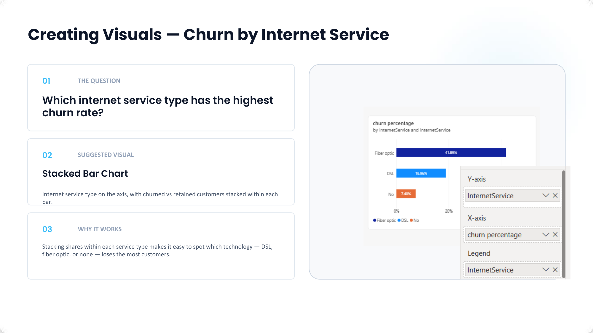
Bar Chart: Churn percentage breakdown by Internet Service provider type.
4
Task #4: Churn by Customer Tenure
Group tenure into 6-month bins to plot churn risk decay over customer lifecycle
Create Tenure Bins: Right-click the
tenure field in the Data pane and select New Group. Set Group type to Bins and Bin size to 6 months.
Create Line Chart: Add a Line Chart visual with
tenure (bins) on the X-axis and churn percentage on the Y-axis.
Analytical Insight: The continuous line chart reveals that churn risk is highest during the first 0–6 months (>50%) and steadily declines as tenure increases, proving that early customer onboarding is critical.
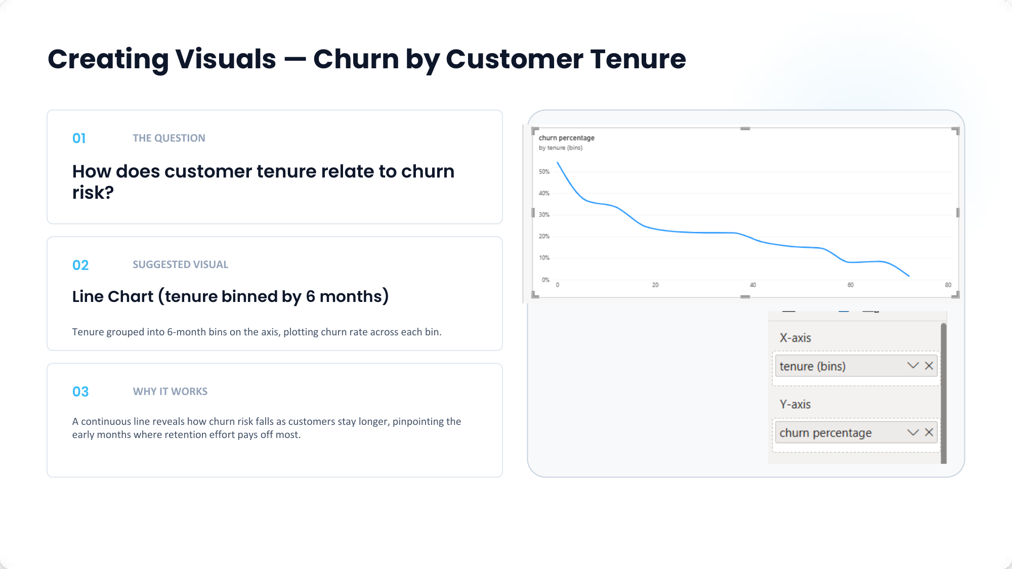
Line Chart: Churn rate decline plotted across 6-month customer tenure bins.
5
Task #5: Churn by Payment Method & Final Dashboard
Analyze billing option attrition and assemble the complete executive dashboard
Add Payment Method Visual: Add a Bar Chart displaying
PaymentMethod on the Y-axis and churn percentage on the X-axis. Electronic check shows the highest attrition rate among payment options.
Assemble Final Dashboard: Arrange the 4 KPI cards at top left, Contract breakdown stacked bar chart at middle left, Tenure line chart at bottom left, and Payment Method & Internet Service bar charts on the right column.
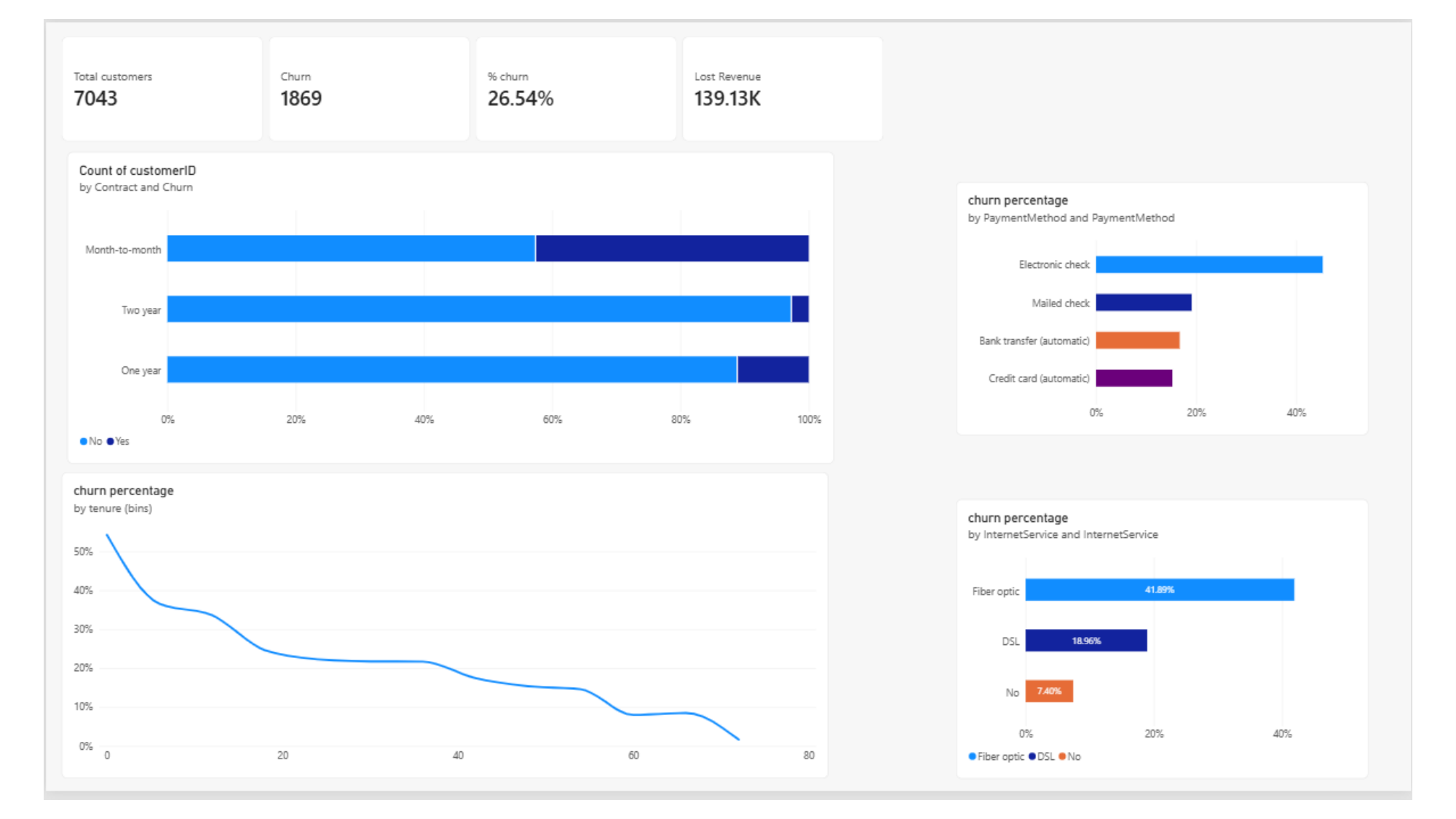
Final Report Page: Executive Telco Customer Churn Analytics dashboard featuring KPI cards, contract shares, tenure risk curve, and billing breakdowns.