We didn't start with theory. We started with a problem — a wrong number in a report —
and let that problem explain why data modeling exists.
How We Got Here
This topic was built from a real scenario in class. Follow the steps to understand
why relationships matter — not just what they are.
1
Setup
We added three new dimension tables
The sales report already had the SalesSheet table.
We imported three more tables — Brand, Products,
and Country — each containing extra information that enriches the sales data.
Loading the three dimension tables into the report.
2
The Question
Can we get total price by country, category, and brand?
We tried to build three visuals — total price by country, by product category,
and by brand name. Country and product category worked fine because Power BI
auto-detected the relationship via matching column names. But brand failed.
Redundancy Error
Power BI detected more than one possible path between SalesSheet and Brand.
It cannot decide which path to use — so it refuses to filter rather than
risk returning wrong results silently.
This is not a bug. It is Power BI protecting you from bad data.
The redundancy error — why it happens and how to fix it in the Model view.
3
The Insight
This is why relationships exist
The error made the lesson obvious — without explicitly defined relationships,
Power BI either guesses (and may guess wrong) or refuses to answer.
Relationships are not optional formatting. They are the rules that tell
Power BI how tables connect and in which direction data flows.
4
The Fix
Go to Model view and define the relationship
Switch to Model view in Power BI Desktop. Drag
ManufacturerID from the Brand table onto
ProductID in the Products table to draw the relationship line.
Power BI now knows the exact path — the error disappears.
Model view — four tables connected by defined relationships.
5
The Result
Back to the report — all three visuals now work
With the relationship defined, the brand visual correctly shows total price per brand.
No error, no wrong totals. The model is now a proper star schema.
Relationships & Cardinality
Every relationship has a cardinality — a rule that defines how many rows in one table
can match rows in another.
One-to-Many
1 → *
The most common relationship. One row in the dimension table matches many rows in the fact table. The dimension side is "1", the fact side is "*".
Example: One ProductID in Products matches many sales rows in SalesSheet.
One-to-One
1 → 1
Each row in one table matches exactly one row in the other. Rare in practice — often a sign the tables could be merged.
Example: One BranchID in a branch table maps to exactly one branch profile record.
Redundancy Error
Happens when Power BI finds more than one active path between two tables. It cannot decide which path to use and blocks the calculation entirely.
Fix: Go to Model view, check your relationship lines, and deactivate or delete the duplicate path.
Filter Direction
Filters always flow from the "1" side (dimension) to the "*" side (fact). When you select a brand name, it filters down to the matching sales rows — not the other way around.
Rule: Dimension tables filter fact tables. Facts do not filter dimensions.
Flat Table vs Star Schema
There are two ways to structure data in Power BI. One works. The other causes problems at scale.
Flat Table
Avoid
Everything is in one giant table. Every row repeats the brand name, city name,
category name — even if they never change between orders.
Repetitive — same text stored thousands of times
Hard to update — change a brand name in 50,000 rows
Slow — Power BI compresses poorly with repeated strings
No filter direction control
Star Schema
Recommended
One central fact table holds only IDs and numbers.
Dimension tables hold the descriptions — connected by relationships.
No repetition — each brand name stored once
Easy to update — change the name in one row
Faster — Power BI is optimized for this structure
Full control over filter direction and cardinality
Flat table vs Star schema — why the structure of your data matters.
Practice Arena
Try It Yourself!
Test your data modeling and reporting skills. Create two separate pages in your Power BI report and build the following visuals. Check off each step as you complete it.
Task Guide
1
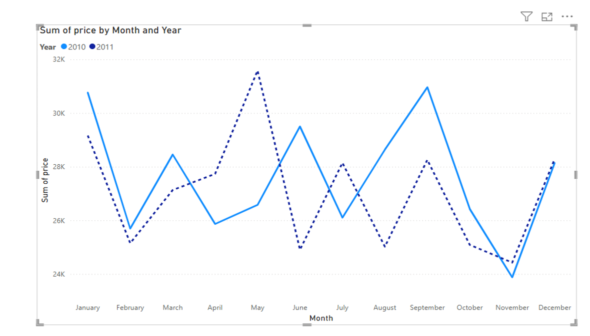
Task 1: Line Chart Trend (2010 vs 2011)
Create a new report page in your workspace.
Insert a Line chart visual onto the canvas.
Drag Month to the X-axis bucket.
Drag Price to the Y-axis bucket (representing total sales).
Drag Year into the Legend bucket to break down the trend lines.
Apply a visual filter to display only two years: 2010 and 2011.
Format 2011 line style to be displayed as dashed, keeping 2010 as a solid line.
Expected output: Line Chart comparison for 2010 & 2011.
2
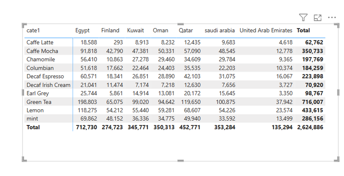
Task 2: Category by Country Matrix
Create a new report page in your workspace.
Insert a Matrix visual onto the canvas.
Drag product category cate1 (from Products table) into the Rows bucket.
Drag country (from Country table) into the Columns bucket.
Drag price (from SalesSheet table) into the Values bucket.
Expected output: Matrix cross-tabulating categories and countries.