Topic Eight
Advanced Visualization
Beyond standard charts — Power BI includes AI-powered and interactive visuals that let you explore data without knowing what question to ask first.
Visual 01
Decomposition Tree
Break a total down across any dimension — in any order, interactively
An AI visual that lets you start with a total and progressively break it down by
any field you choose — one level at a time. Each branch shows how much each category
contributes, and you can switch the breakdown dimension at any level without rebuilding the visual.
In Class — Sales Dataset
Breaking down Total Price step by step
We start with the grand total of price, then ask — what drives it?
We decompose it one level at a time, choosing the dimension at each step.
Total Price
Country
City
Year
Branch
Category
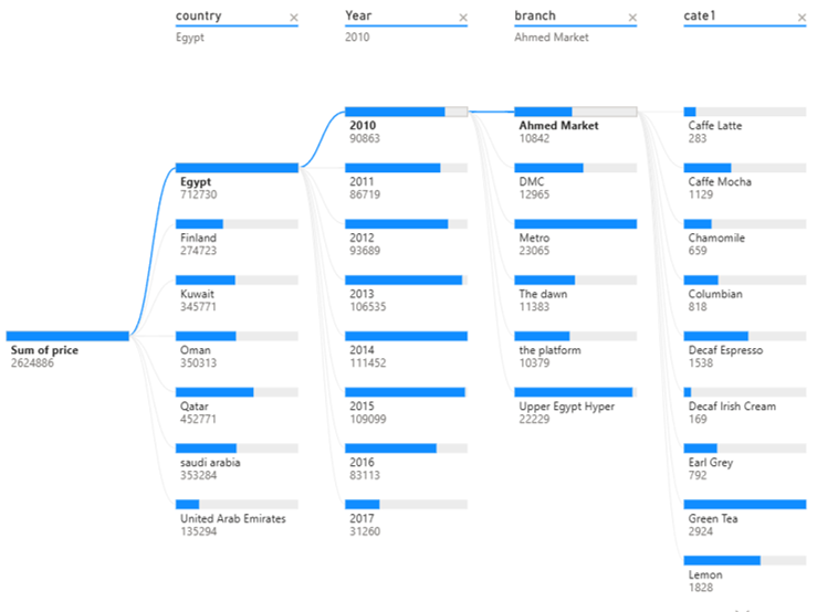
Decomposition Tree — Total Price broken down through five levels of the sales hierarchy.
Visual 02
Key Influencers
Discover which factors most affect an outcome — powered by AI
An AI visual that automatically analyzes your data to find which fields
most strongly increase or decrease a target outcome. You tell it what to analyze
and which fields to consider — it ranks them by impact and explains the relationship
in plain language.
In Class — Titanic Dataset
What factors most affected survival?
We load the Titanic passenger dataset and ask the visual to analyze the
Survived outcome. We give it three factors to investigate —
and let the AI rank which one mattered most.
Age
Gender
Passenger Class
Survived?
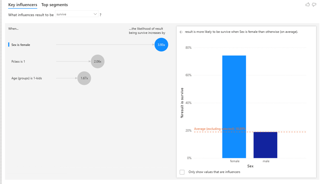
Key Influencers — analyzing which of age, gender, and class most influenced survival on the Titanic.
Visual 03
Q & A
Ask your data questions in plain English — get a visual back
The Q&A visual lets users type a question in natural language —
"total sales by city last year" — and Power BI renders the appropriate visual automatically.
It uses the column names and synonyms in your model to interpret the question.
Worth understanding conceptually, but do not build new reports around it.
Visual 04
Smart Narratives
Auto-generated text summaries that update as filters change
Smart Narratives generates a written summary of your data — automatically.
It reads the key numbers, trends, and outliers in your report and writes a paragraph
describing them. The text updates dynamically when slicers or filters change,
so it always reflects what's currently visible.
How to use it
Add a narrative to any report page
Insert → Smart Narrative — Power BI reads the visuals on the page and generates
a text summary automatically. You can also click any value in the narrative
to edit it and add your own DAX-powered dynamic values inside the text.
This is especially useful for executive summary pages where readers want a written
explanation alongside the charts.
Image / video coming soon
Visual 05
Custom Visuals
Extend Power BI with visuals built by the community and third parties
Power BI's built-in visual library covers most needs — but when it doesn't,
you can add any visual from AppSource, Microsoft's marketplace for
Power BI extensions. These are built by Microsoft partners and the community.
Some are free, some are paid. The key skill is knowing how to find, install, and
trust a custom visual — the specific visual is secondary.
In Class — Gapminder Dataset
Adding Play Axis — animated time slider
We use the Gapminder dataset (countries, life expectancy, GDP, population over decades)
and add the Play Axis custom visual. It adds an animated time slider to
any scatter chart — press Play and watch the data evolve year by year.
The point here is not Play Axis specifically — it is the workflow: how to search AppSource, evaluate a visual, install it, and use it in a report. That skill transfers to any custom visual you will ever need.
The point here is not Play Axis specifically — it is the workflow: how to search AppSource, evaluate a visual, install it, and use it in a report. That skill transfers to any custom visual you will ever need.
1
In the Visualizations pane, click the three dots (…) at the bottom → Get more visuals.
2
Search for the visual by name in the AppSource marketplace. Check the publisher, rating, and last update date before adding.
3
Click Add — the visual appears in your Visualizations pane and is now available for this report.
4
Use it like any other visual — drag fields into its wells and format as needed.
Image / video coming soon