Topic 13
Pivot Tables
Learn how to group, aggregate, and calculate statistics using Excel Pivot Tables. We will revisit the StaffData.xlsx spreadsheet from Topic 02 to answer the headcount and salary questions without typing any formulas.
Step 1 — Data Summarization & The 4 Quadrants
A Pivot Table is an interactive tool that summarizes large datasets in seconds. Instead of writing formulas like COUNTIF or SUMIF, you select data fields and place them into four main areas.
1. Summarization / Grouping: The categories we slice by. These go into Rows or Columns.
2. Calculation / Aggregation: The numbers we calculate. These go into Values.
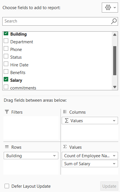
The Excel PivotTable Fields pane contains four drop quadrants (pivot1):
Step 2 — Building Headcount & Total Salary
To find the total salary and staff count by building, we align our fields to the quadrants:
• Group by Building → Drag Building to Rows.
• Count staff → Drag Employee Name (or ID) to Values (Excel defaults to Count for text).
• Sum salaries → Drag Salary to Values (Excel defaults to Sum for numbers).
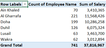
This results in the following Pivot Table output (pivot3). Notice that the headcounts and salaries are identical to what we calculated using formulas in Topic 02:
Step 3 — Multiple Calculations (Sum, Average, Max, Min)
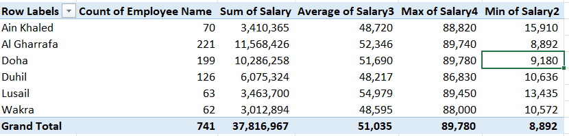
You can drag a single numeric field to the Values box multiple times. Each instance can be configured to perform a different type of calculation (e.g. Average, Max, Min).
The resulting Pivot Table displays different calculations for the same salary data by building (pivot4):
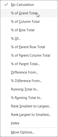
Step 4 — Show Values As (% of Grand Total)
Rather than changing the math logic itself, you can change the display type of a values column to represent ratios or percentages.
This allows you to see both the raw salary sum and the proportion it represents of the company's total payroll (pivot5):
| A | B | C | |
|---|---|---|---|
| 1 | Row Labels | Sum of Salary | Sum of Salary (% of Grand Total) |
| 2 | Ain Khaled | 3,410,365 | 9.02% |
| 3 | Al Gharrafa | 11,568,426 | 30.59% |
| 4 | Doha | 10,286,258 | 27.20% |
| 5 | Duhil | 6,075,324 | 16.07% |
| 6 | Lusail | 3,463,700 | 9.16% |
| 7 | Wakra | 3,012,894 | 7.97% |
| 8 | Grand Total | 37,816,967 | 100.00% |
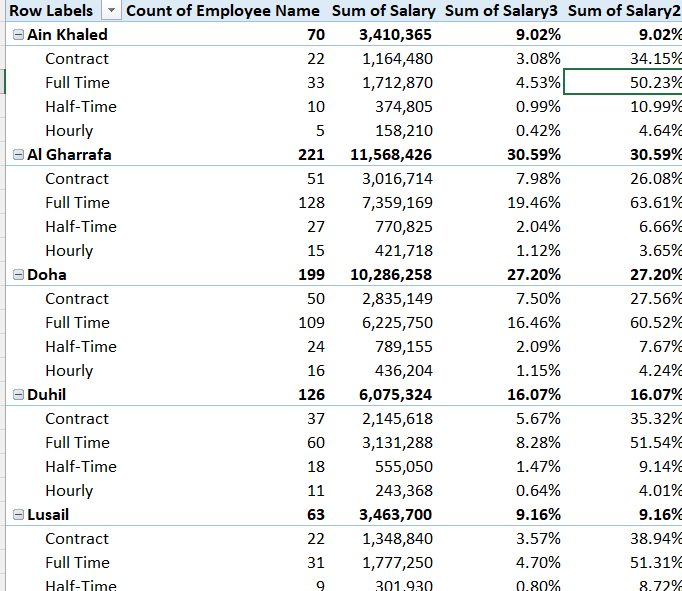
Step 5 — Cascading Summaries & Parent Row Ratios
Adding multiple fields to the Rows box creates nested hierarchies (cascading summaries). We can then analyze how subdivisions contribute to their parent categories.
Dragging the Status field below Building creates a nested layout where you see headcount and salary details segmented by worker type (pivot6):
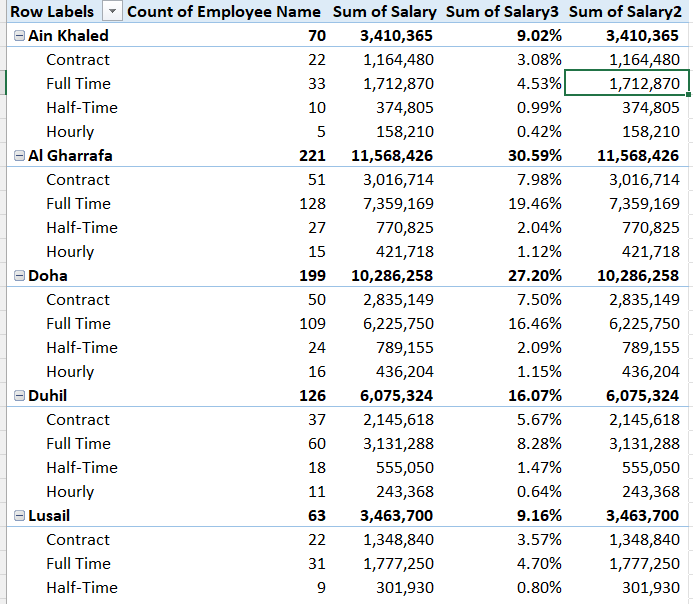
The parent row is the topmost category (Building). The nested rows (Status) will show what percentage of the building's total salary goes to Full-time vs Part-time workers (pivot7):
Self-Check — Verify Your Pivot Table Output
Build the Pivot Table inside StaffData.xlsx as shown above, then input your numbers below to verify they match.
| Summary Metric | Your Value |
|---|---|
| Ain Khaled Headcount | |
| Lusail Total Salary | |
| Grand Total Headcount (All Buildings) | |
| Grand Total Salary (All Buildings) |