Comprehensive Lab · Hands-on Exercise
US Disease Data Modeling & Visualizations
A comprehensive capstone lab analyzing historical US disease outbreak and vaccination records. Clean data errors in Power Query, establish a 1:M dimensional model, analyze vaccination impact with dynamic reference lines, group historical eras, and synchronize slicers across interactive report pages.
You are employed as a Data Analyst with the Health Department.
You have assembled important disease information which you would like all your department staff to be aware of. The data is currently stored in an Excel file (
diseas.xlsx), but you feel that it would be easier for staff to read and assimilate in the form of a Power BI report. You will create a Power BI report focusing on an analysis of disease data broken down by state, year, and historical eras.
0
Setup & Data Transformation
Load tables and clean data quality errors in Power Query
Connect to Data: In Power BI Desktop, select Get Data → Excel workbook and choose
diseas.xlsx.
Select Table Objects: In the Navigator dialog, select the two structured tables:
disease and vaccination (make sure you select the table objects, not the raw sheet objects), then click Transform Data.
Replace Errors in Population: As the
[population] column contains errors caused by text NA values, use Power Query to replace the NA / error values with 0.
Column Quality Check: Enable Column Quality from the View ribbon tab and verify that the entire
population column is 100% valid and error-free.
Click Close & Apply on the Home ribbon to load the cleaned tables into Power BI.
1
Task #1: Number Formatting
Format key numerical columns with thousands separators
Select the
count column in the Data/Fields pane. In the Column tools ribbon, click the comma (,) icon to format the numbers with a comma thousands separator.
Select the
population column and format the numbers with a comma thousands separator in the Column tools ribbon.
2
Task #2: Data Modeling
Configure 1:M relationship between Vaccination and Disease tables
Switch to the Model view. Ensure there is an active 1:M (one-to-many) relationship between
vaccination[Disease] (1) and disease[disease] (*).
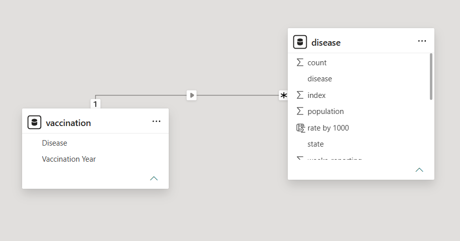
One-to-many (1:*) relationship from vaccination table to disease table.
3
Task #3: Check the Impact of Vaccination
Build the [vaccinations] report page with single-select slicer & X constant reference line
Name the report page vaccinations.
Create Line Chart: Add a Line Chart visual to the canvas with
year on the X-axis and count (Sum of count) on the Y-axis.
Add Disease Slicer: Add a Slicer visual using
Disease from the vaccination table (using this table ensures correct cross-filtering across the model). In the slicer formatting settings, enable Single select (radio buttons).
Add Metric Card: Add a Card visual to display the selected disease's
Vaccination Year.
Add X-Axis Constant Line: In the line chart's Analytics pane, add an X-axis Constant Line corresponding to the introduction year of the vaccine (e.g. 1940 for Pertussis) with a dashed stroke.
Observe the Impact: Switch between diseases (e.g. Pertussis, Measles, Polio) to observe the sharp drop in cases following the vaccination introduction year.
Page Background & Formatting: In Canvas background / Wallpaper settings, add
disease.jpg as wallpaper, set image fit to Fill, and remove the background of visuals for a clean transparent overlay.
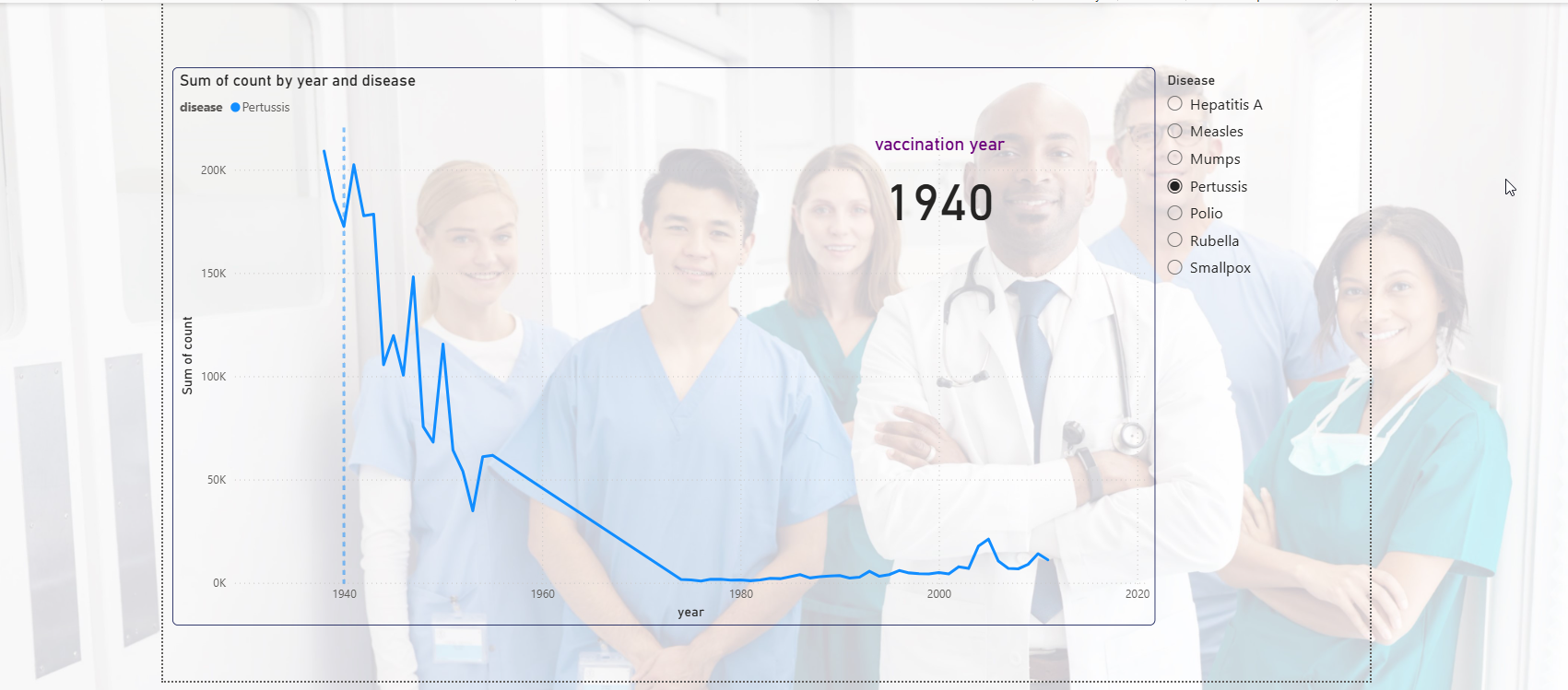
Vaccinations report page: Single-select disease slicer, vaccination year card, and trend line chart with X constant reference line.
4
Task #4: Historical Analysis & Year Groupings
Create custom era bins and filter Top 3 diseases on the [history] page
Create a new report page named history.
Create Year Groups: Right-click the
year column in the disease table and choose New group. Group the years into the following ranges:
1928-1949: 1-pre world war II (Pre-World War II)1950-1969: 2- Post war (Post-war economic)1970-1989: 3-cold war (Cold War)1990-2011: 4-digital age (The digital age)
Slicer Tiles: Add a Slicer visual using your new
year (groups) field. Set the slicer layout style to Tile (horizontal buttons across the top of the canvas).
Line Chart with Top 3 Filter: Create a Line Chart with:
- X-axis:
year - Y-axis:
count(Sum of count) - Legend:
disease
disease to show the Top 3 diseases by value Sum of count.
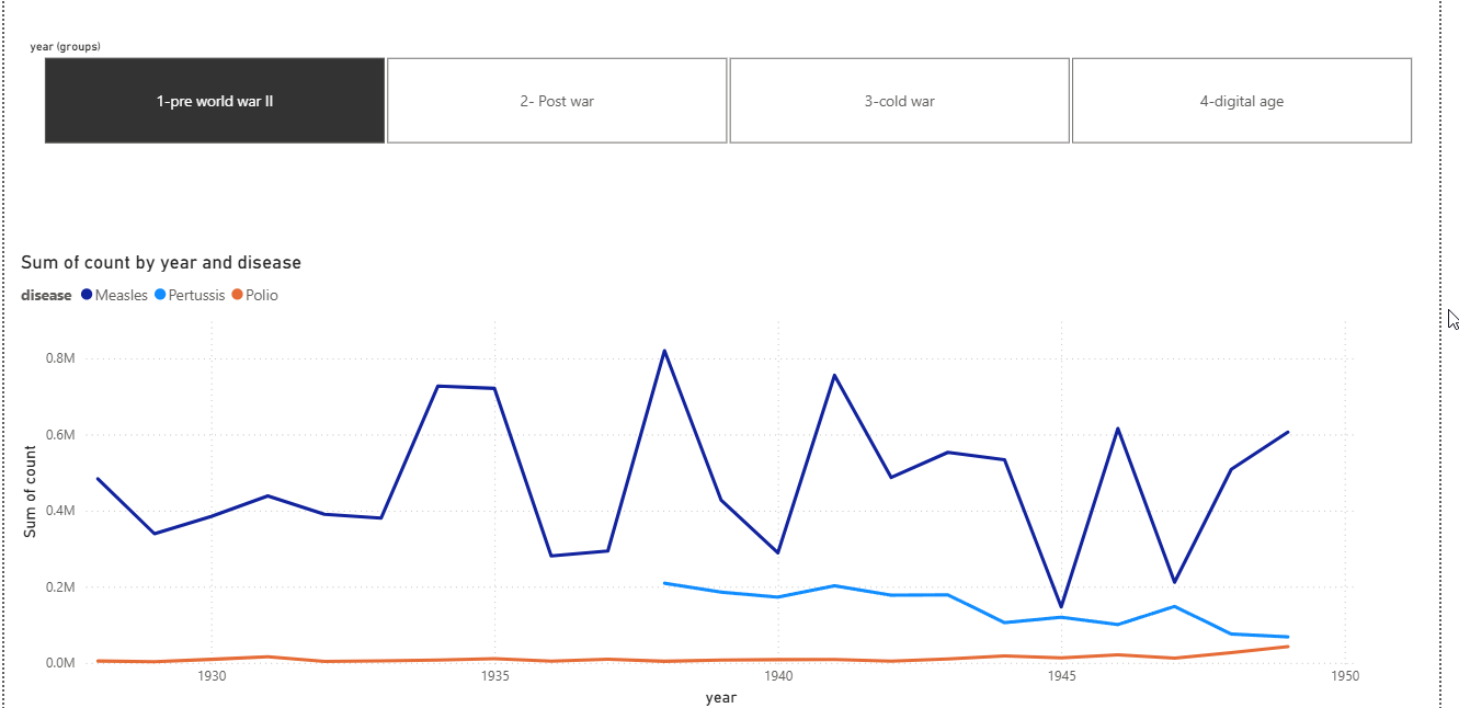
History report page: Year group slicer tiles and line chart showing top 3 diseases over time.
5
Task #5: Matrix & Multi-Visual Analytics
Build the [matrix] report page and configure slicer synchronization
Create a new report page named matrix.
Visualization #1 (Matrix): Add a Matrix visual to show the distribution of disease cases across the year groups (Rows:
disease, Columns: year (groups), Values: Sum of count). Place it at the bottom of the canvas. In the formatting settings, turn off Row subtotals and Column subtotals.
Visualization #2 (Line Chart with Average Line): Add a Line Chart with
year on the X-axis and count on the Y-axis. In the Analytics pane, add a Y-axis Average line to indicate benchmark threshold levels.
Visualization #3 (Sync Slicer): Go to the View tab → Sync slicers pane. Sync the disease slicer from page one (
vaccinations) to filter this page synchronously.
6
Tasks #6 & #7: Formatting, Borders & Save
Polish visuals, add consistent borders, and save report
Borders & Alignment: Add subtle borders around each visualization, configure balanced padding, and ensure harmonious spacing across the canvas.
Rename & Save: Rename the primary report page to Disease Information (or keep distinct page tabs: Vaccinations, History, Matrix). Save your completed project file as
Disease_Data_Report.pbix.