Lab 06 · Hands-on Capstone
Databel Customer Churn Analysis
A comprehensive capstone lab analyzing telecom subscriber data. Build data models, design DAX churn rate measures, categorize age demographics using binning, and design geographic maps to visualize churn hotspots.
You are employed as a Lead Data Analyst at Databel Telecom.
You have been tasked with loading customer telecom subscription data and analyzing churn patterns. Trainees must verify data uniqueness, construct DAX measures for churn metrics, configure visualizations by category and reasons, link additional regional data, and create binned age group analyses.
1
Data Loading & Integrity Check
Verify there are no duplicate entries in Customer ID
Load the dataset from
Databel.csv located in the datafiles folder.
Go to the **Report view** and confirm there are no duplicate entries in the
Customer ID field. Use a visual to compare total customers vs. unique customers, or create a custom DAX measure to check for duplications:
Duplicate Count = COUNT(Databel[Customer ID]) - DISTINCTCOUNT(Databel[Customer ID])
2
Customer Churn Page
Create churn rate indicators and visual summaries
Create a measure to find how many customers have left (where
Churn Label is "Yes"):
Number of Churn = CALCULATE(COUNT(Databel[Customer ID]), Databel[Churn Label] = "Yes")
Create a measure for total customers and the percentage of customer churn:
Total Customers = COUNT(Databel[Customer ID])
Churn Rate = DIVIDE([Number of Churn], [Total Customers], 0)
Add a **Multi-row Card** visual at the top of your **Customer churn** report page and populate it with your new measures.

Multi-row card showing total customers, churned customers, and churn rate.
Below the card, add a **Donut Chart** to display the number of customers churned by
Churn Category. Filter this specific visual to remove "Other" and blank/null categories.
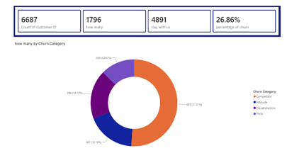
Donut chart showing churned customers by key churn categories.
3
Reasons for Churn Page
Identify the primary drivers of subscriber cancellations
Create a new report page named **Reasons**. Add a **Stacked Bar Chart** to show the number of churned customers by
Churn Reason.
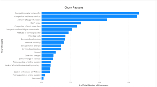
Bar chart detailing specific reasons for subscriber cancellations.
4
Geographical Model & Map
Link external city data and plot maps
Load the table/sheet
country from the file country.xlsx located in the **datafiles** folder.
Create a relationship: Go to Model view, and drag a relationship line between
State from the main Databel table and city from the country table.
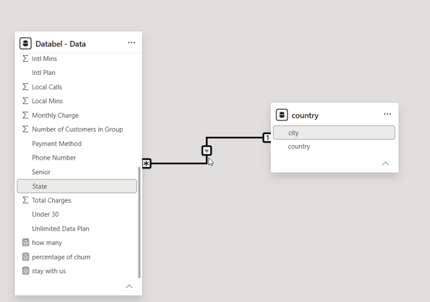
Setting up the relationship between Databel and country tables.
Create a new page named **Map** and add a **Map** visual. Use fields from your linked tables to display customer churn geographical distribution. (Note: if the standard Map is retired or blocked in your tenant, use the **Azure Map** visual instead).
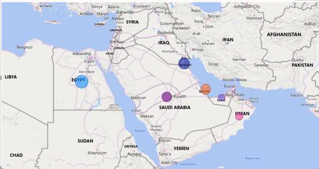
Geographical distribution of customer churn.
5
Age Group Binning & Combo Charts
Categorize demographics and analyze trends
Create an age group bin using a size of **5**: right-click on the
Age column in the Fields pane, select **New Groups**, set the **Group type** to **Bin**, and the **Bin size** to 5.
Create a **Line and Stacked Column Chart** (Combo Chart) on a page named **Age Group**:
- **X-axis**: `Age (bins)`
- **Column y-axis**: `Total Customers` (count of Customer ID)
- **Line y-axis**: `Number of Churn`
Format the line: go to the visual formatting options under **Lines**, set the color to **red**, enable shading, and make the stroke style **dashed**.
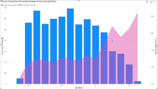
Combo chart displaying total customers vs. churn rate across age bins.