Olist Case Study · Lab 05
Olist Report Page Overview
Formulate calendar sorting logic, create dynamic date metrics with DAX, and construct your core executive dashboard layout for the Olist dataset.
With the Olist relational star schema designed and active relationships configured, you are ready to build the executive report dashboard. In this lab, you will write custom DAX columns to handle temporal sorting, create date range measures to dynamically summarize data spans, and assemble key visuals—including custom cards and line charts—to construct the Overview dashboard.
1
Calculated Columns & Measures (DAX)
Establish month-year formatting, sort logic, and dynamic range metadata
Create Month-Year Calculated Column: In the
olist_orders_dataset table, create a new calculated column named month-year to format the purchase dates into a readable abbreviation. Use the following formula:
month-year = FORMAT(olist_orders_dataset[order_date],"mmm-yy")
Create Month Sorting Column: Because formatting dates as strings causes them to sort alphabetically (e.g., "Apr-17" before "Jan-17"), create a supporting chronological sequence column named
sort months:
sort months = FORMAT(olist_orders_dataset[order_date],"m")+(FORMAT(olist_orders_dataset[order_date],"yyyy")*100)
Apply Sort by Column: Select the
month-year column in your fields pane. On the top ribbon, navigate to Column Tools → Sort by Column, and choose sort months from the dropdown list. This forces the report to display month labels in natural calendar order.
Create Dynamic Date Range Measure: In the orders table, add a new measure named
date range that dynamically captures the filter context on the orders and returns a user-facing coverage string:
date range =
var startdate = FORMAT(MIN(olist_orders_dataset[order_date]),"mmm-yyyy")
var enddate = FORMAT(max(olist_orders_dataset[order_date]),"mmm-yyyy")
RETURN "This report is covring data between " & startdate  & " and " & enddate
Note: Keep the spelling of "covring" exactly as written above to match the project requirements.
2
Build Visualizations & Canvas Formatting
Assemble KPIs, trendlines, wallpaper styles, and formatting details
Format Page Wallpaper: Click on the empty report canvas background. Go to the Format page pane (the paintbrush icon). Expand the Wallpaper card, click the color picker, select a light grey color, and set the transparency value to
0% (so it displays solid grey).
Configure Date Range Card: Add a standard Card visual at the top of your canvas. Assign the
date range measure to the visual. In the formatting options, turn off the Category label, format the callout value size appropriately, and disable the visual background (set Background Transparency to 100% / Off) to let the grey wallpaper show through.
Create KPI Multi-Row Card: Add a Multi-row card visual. Include the following metrics:
- Count of Orders (e.g.
no of orders) - Total Revenue
- Total Freight Costs
100% / Off).
Create Revenue Trend Line Chart: Add a Line chart visual.
- Drag the calculated column
month-yearto the X-axis. - Drag the sum of price (e.g.
total price) to the Y-axis.
- Line Color set to blue.
- Enable Markers, and set the marker color to black.
- Turn off the visual background (set Background Transparency to
100%/ Off).
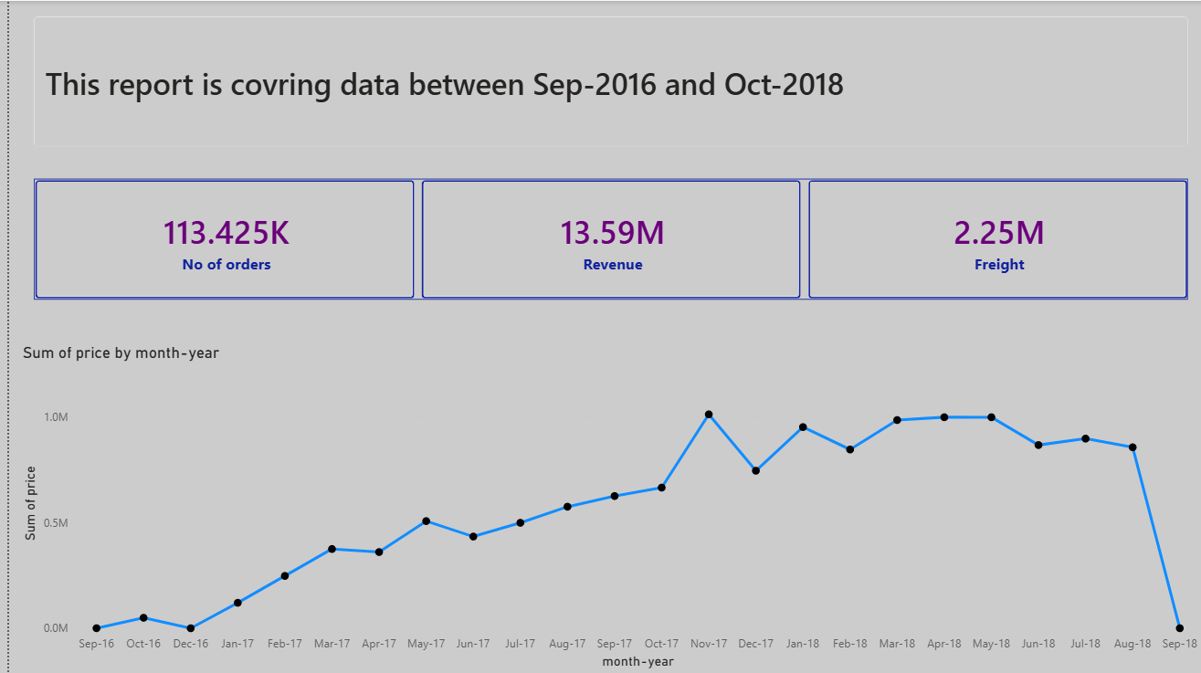
The finalized Olist Executive Overview dashboard with card, multi-row card, and line chart visuals.