When you select any visual in Power BI Desktop, the Visualization pane shows
three panels — Build, Format, and Analytics. Understanding what each one controls
is the core skill of this topic.
Build
Control what data goes into the visual and how it is structured — fields, aggregation, grouping.
Format
Control how the visual looks — colors, fonts, labels, borders, display units.
Analytics
Add statistical overlays — reference lines, averages, trends, and forecasts.
Build
Drag fields into the well, then control how those fields behave inside the visual.
Link Fields
Drag columns from the Fields pane into the Axis, Values, or Legend wells to populate the visual.
Change Aggregation
Click the dropdown on any value field to switch between Sum, Average, Count, Min, Max, and more.
Legend
Drop a category field into the Legend well to color-code the visual or break it down into sub-series.
Small Multiples
Add a field to the Small Multiples well to repeat the same chart once per category — side by side.
Rename Results
Double-click any field name in the Build well to rename it — the new label appears in the visual and tooltip.
In class — Aggregation
Switch Price from Sum to Average
In the Build pane, click the dropdown arrow next to Sum of Price and select Average.
The card or column immediately updates to show the average transaction value instead of the total.
Then rename it from "Average of Price" to something cleaner like "Avg. Price".
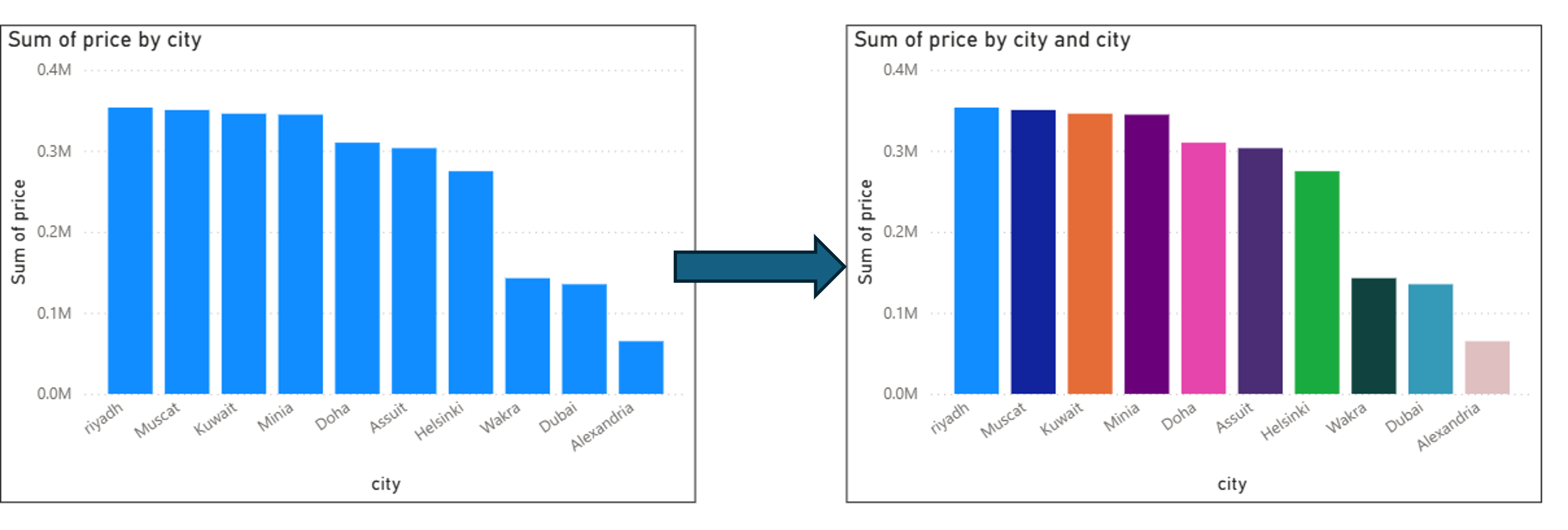
In class — Legend
Add city to the Legend of the Column Chart
Drag the city field into the Legend well of the clustered column chart.
we can use the legend only for applying different colors to each column
Legend applied to the column chart — each city gets its own color.
In class — Small Multiples
Add City to the Yearly Line Chart
Drag City into the Small Multiples well of the yearly sales line chart.
Power BI repeats the line chart once per city — so you see each city's yearly trend
side by side, making it easy to compare growth patterns across locations.
Format
The Format pane has two sub-sections — Visual (styles specific to that chart type) and General (position, size, title, effects).
Visual
Settings unique to the selected chart type — bar colors, data labels, column width, line style, table column formatting.
General
Settings shared across all visuals — title text, position, size, border, shadow, and background color.
Watch out — Display Units. Power BI automatically rounds large numbers.
A sum of 2,600 may display as 3M (3 million) — which is
mathematically rounded but completely wrong from a data analysis perspective.
Always check Format → Visual → Display Units and set it to None or the correct unit.
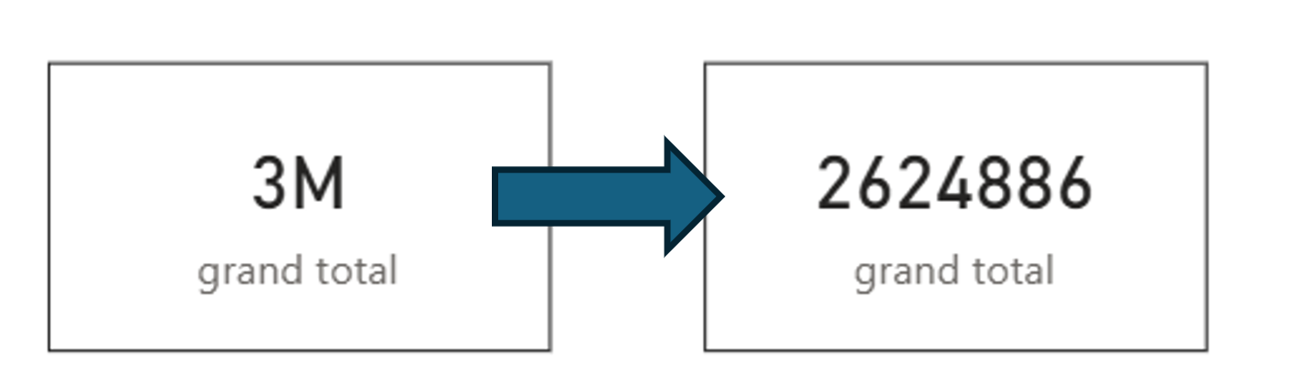
In class — Visual › Card
Remove Display Units to Show the Real Number
The Total Price card shows 3M by default — Power BI is rounding
26,443,972 up to 3 million. This is misleading.
Fix it by selecting the Card → Format → Visual → Callout Value
→ Display Units → set to None.
The card will now show the exact value: 26,443,972.
Format → Visual → Callout Value → Display Units → None. The card now shows 26,443,972 instead of 3M.
In class — Visual › Table
Format a Specific Column in the Table
Select the table → Format → Visual → Specific Column.
Choose the Price column and adjust its alignment, background color, or font weight
to make it stand out from the other columns.
In class — Visual › Line Chart
Add Markers to the Line Chart
Select the line chart → Format → Visual → Markers → toggle On.
A dot appears at each data point on the line, making individual values easier to
read — especially useful when the chart is small or has few data points.
Analytics
The Analytics pane adds statistical overlays on top of your visual.
What's available depends entirely on the visual type —
a donut chart has no analytics options, a line chart has the most.
Line / Option
Column Chart
Line Chart
Bar Chart
Donut / Pie
Constant Line
Yes
Yes
Yes
No
Average Line
Yes
Yes
Yes
No
Forecast
No
Yes
No
No
Min / Max Lines
Yes
Yes
Yes
No
If the Analytics pane shows no options, the selected visual type simply does not support them.
Switch to a column or line chart to unlock reference lines and forecasting.
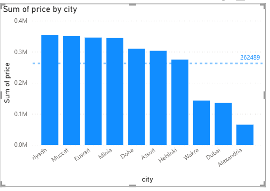
In class — Column Chart
Average Line on the City Column Chart
Select the column chart → Analytics → Average Line → Add.
A horizontal dashed line appears at the average value across all cities,
making it immediately clear which cities are above and which are below the overall average.
Average line on the city column chart — cities above the line immediately stand out.
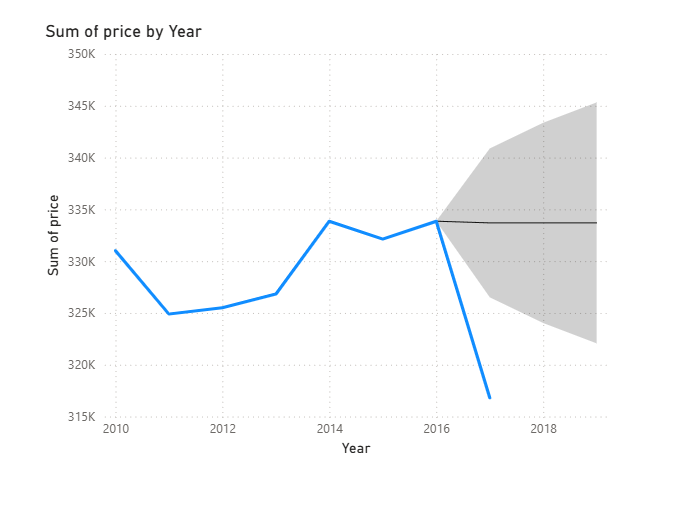
In class — Line Chart
Forecast on the Yearly Sales Line Chart
Select the line chart → Analytics → Forecast → Add.
Set the forecast length (e.g. 2 periods) and confidence interval.
Power BI extends the line with a shaded prediction band — useful for showing
expected future sales trends based on historical patterns.
Forecast applied to the yearly sales line chart — the shaded band shows the predicted range.